 BACK TO OUR WORK
CLIENT: NHS North East London
SECTOR: Healthcare
SCOPE: Website Design & Development
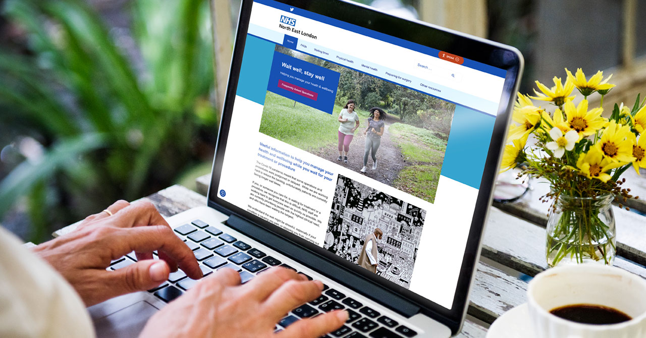
Our healthcare communications agency skill set was called up again recently. NHS North East London scoped out a new public facing microsite. The objective would be to support patients who have been referred by their GP's. But, where the wait could be quite long for their first appointment. The NHS is currently prioritising people with the highest clinical need. Waiting for treatment or a procedure can be frustrating. Those who have been waiting the longest will be seen first, so what to do if you are not deemed a priority? The website would need to help answer any questions that the public might have. But more importantly how to manage your health and wellbeing whilst waiting.
A user-friendly design with a responsive layout was deployed. An intuitive interface albeit typically NHS with simple content organisation was designed. The website needed to have accessible navigation. It also needed to be as easy to use as possible and accessible to everyone. Our ‘Wait Well, Stay Well’ website has lots of useful information. This includes supplying up-to-date guidance on current waiting times at local hospital trusts. Along with local resources that could be accessed for extra support.
FAQs, good advice on physical and mental health. Plus tips on activity, health diet and smoking are all addressed. Psychological & emotional support is displayed. As well as what help is available for those that feel like they may be struggling to cope. There is Reach Deck integration which adds text-to-speech, reading and translation support. This feature assists visitors with instant access to assistive features. It helps to reduce barriers between the digital content and diverse online audiences. Many NHS websites are informative and text heavy. Whereas this website takes a softer more visually engaging approach. The imagery used helps to instantly capture the attention of any anxious website visitors. It creates a positive, reassuring impression. The website loads fast and has search functionality. There is on-brand consistency with usual NHS brand elements, such as the logo, colours, and visual style. This website works well for the North East London audience and provides a visually appealing user experience.